Colour in game design: contrast, meaning and emotion
What colour psychology can and cannot tell game designers, why contrast matters more than hue, and how to make coloured pieces readable for everyone.
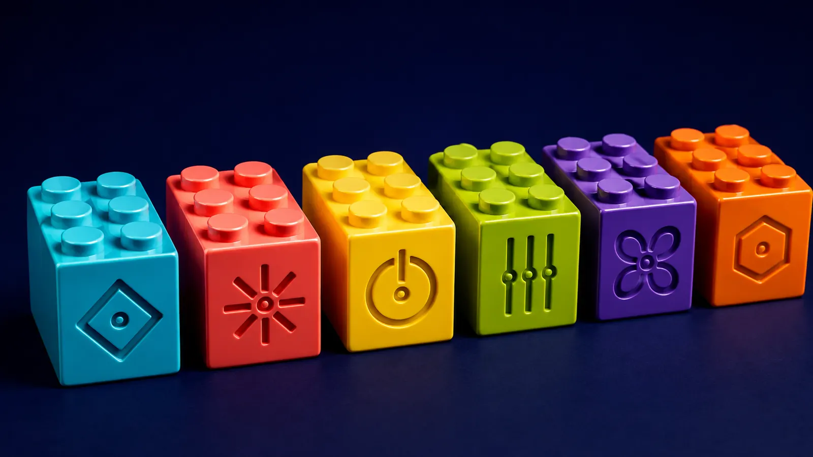
Colour is the first thing you notice about most games and the last thing most players think about. Red means danger, green means go, gold means treasure, and nobody had to tell you. Designers lean on colour constantly, to set a mood, to signal what matters, and, in a colour-sort puzzle, to carry the rules themselves. Popular writing about colour psychology is full of confident claims: blue calms, red excites, yellow makes you hungry. The research is more interesting and more cautious than that. What it supports most strongly is less glamorous than mood: contrast, consistency and never relying on colour alone.
Andrew Elliot and Markus Maier’s review in the Annual Review of Psychology is a good corrective to pop colour psychology. It shows that colour can carry important meaning and can influence people’s feelings, thinking and behaviour, with much of the evidence coming from achievement and attraction contexts. It also warns that the field is at an early stage: earlier work suffered from methodological problems, and much more is needed on boundary conditions and real-world generalisability before strong recommendations are justified.
For game designers, that suggests humility. Popular claims about particular colours often run well ahead of this evidence, and very little of it was gathered while people were actually playing games, so the review’s call for more work on real-world settings applies to game design with extra force. Colour is a real lever, but claims like “this shade of blue lowers stress” should be treated as hypotheses to test with your own players, not as rules.
Sources1Elliot, A. J., & Maier, M. A. (2014). Color psychology: Effects of perceiving color on psychological functioning in humans. Annual Review of Psychology, 65, 95–120.
Erik Geslin, Laurent Jégou and Danny Beaudoin studied colour inside games specifically. They showed 24 video game images to 85 participants, asked how each made them feel, and compared the answers with measurements of the images’ colour. Brightness, saturation and lightness correlated significantly with emotions including joy, sadness, fear and serenity, and so did measures of how varied and eye-catching the colours were.
The study measured reactions to still images, not play, and correlations of this kind cannot prove cause. But it gives designers a vocabulary that is more useful than hue alone: the overall lightness and saturation of a scene, and how varied its colours are, may matter as much to its mood as which colours are in it. The authors use their results to propose “emotional colour scripting”, planning a game’s palette the way a film plans its lighting.
Sources3Geslin, E., Jégou, L., & Beaudoin, D. (2016). How color properties can be used to elicit emotions in video games. International Journal of Computer Games Technology, 2016, 5182768.
When the job is to be read, contrast wins. Richard Hall and Patrick Hanna tested four text and background colour combinations on web pages with 136 participants. Combinations with a greater contrast ratio were generally more readable. Colour did not significantly affect how much people remembered, but preferred colours earned higher ratings for aesthetics.
Gordon Legge and colleagues looked more closely at how contrast works. Normal readers could read as fast with strong colour contrast, text differing only in hue, as with strong luminance contrast, the difference in lightness. For readers with low vision, luminance contrast won every time. A design that separates pieces only by hue at similar lightness works for some players and fails others. The web’s accessibility guidelines set minimum contrast ratios for exactly this reason; the W3C’s explanation of contrast minimums is a clear primer.
Sources4Hall, R. H., & Hanna, P. (2004). The impact of web page text-background colour combinations on readability, retention, aesthetics and behavioural intention. Behaviour & Information Technology, 23(3), 183–195.5Legge, G. E., Parish, D. H., Luebker, A., & Wurm, L. H. (1990). Psychophysics of reading. XI. Comparing color contrast and luminance contrast. Journal of the Optical Society of America A, 7(10), 2002–2010.
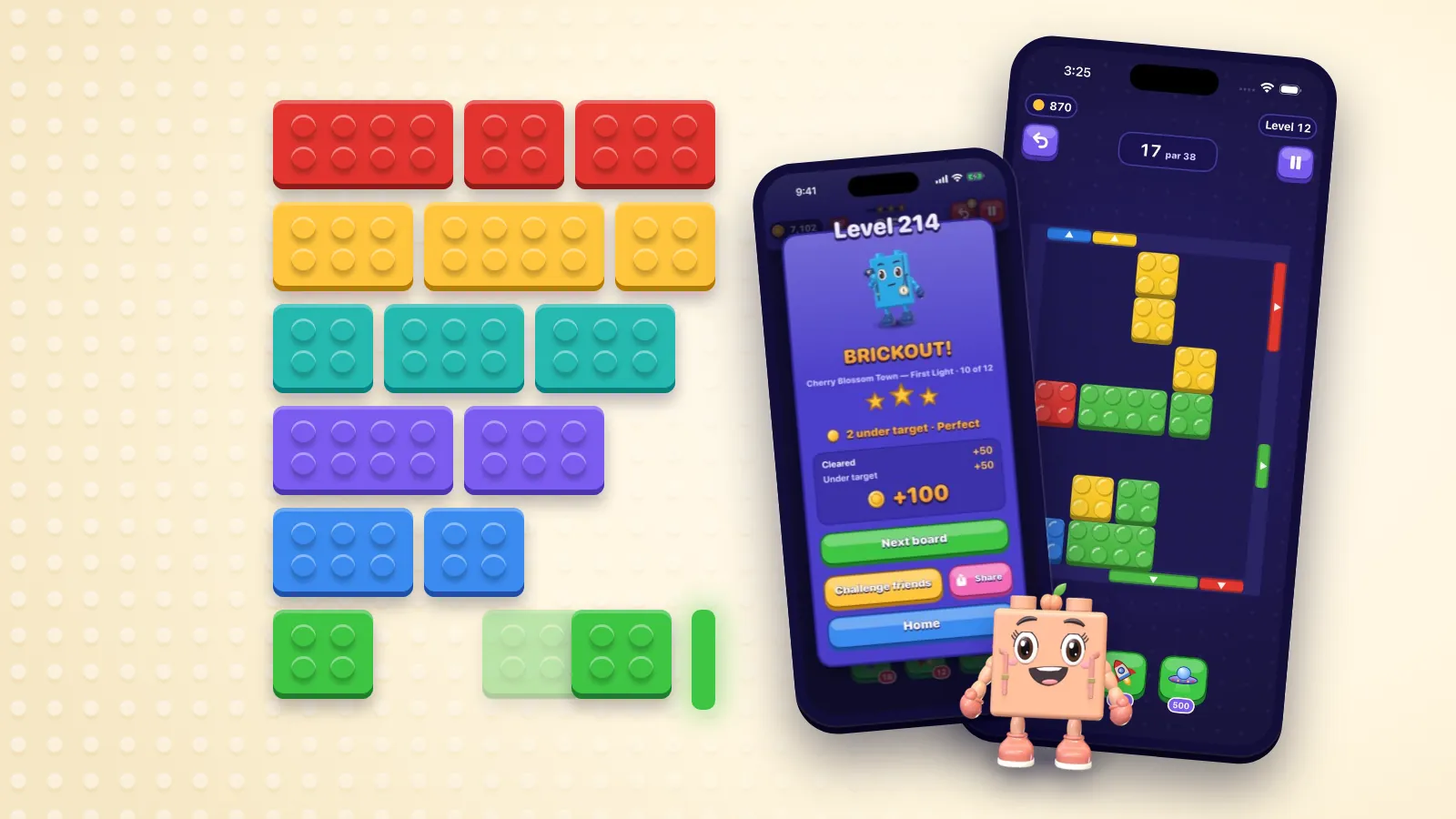
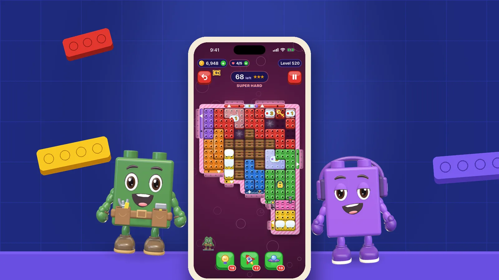
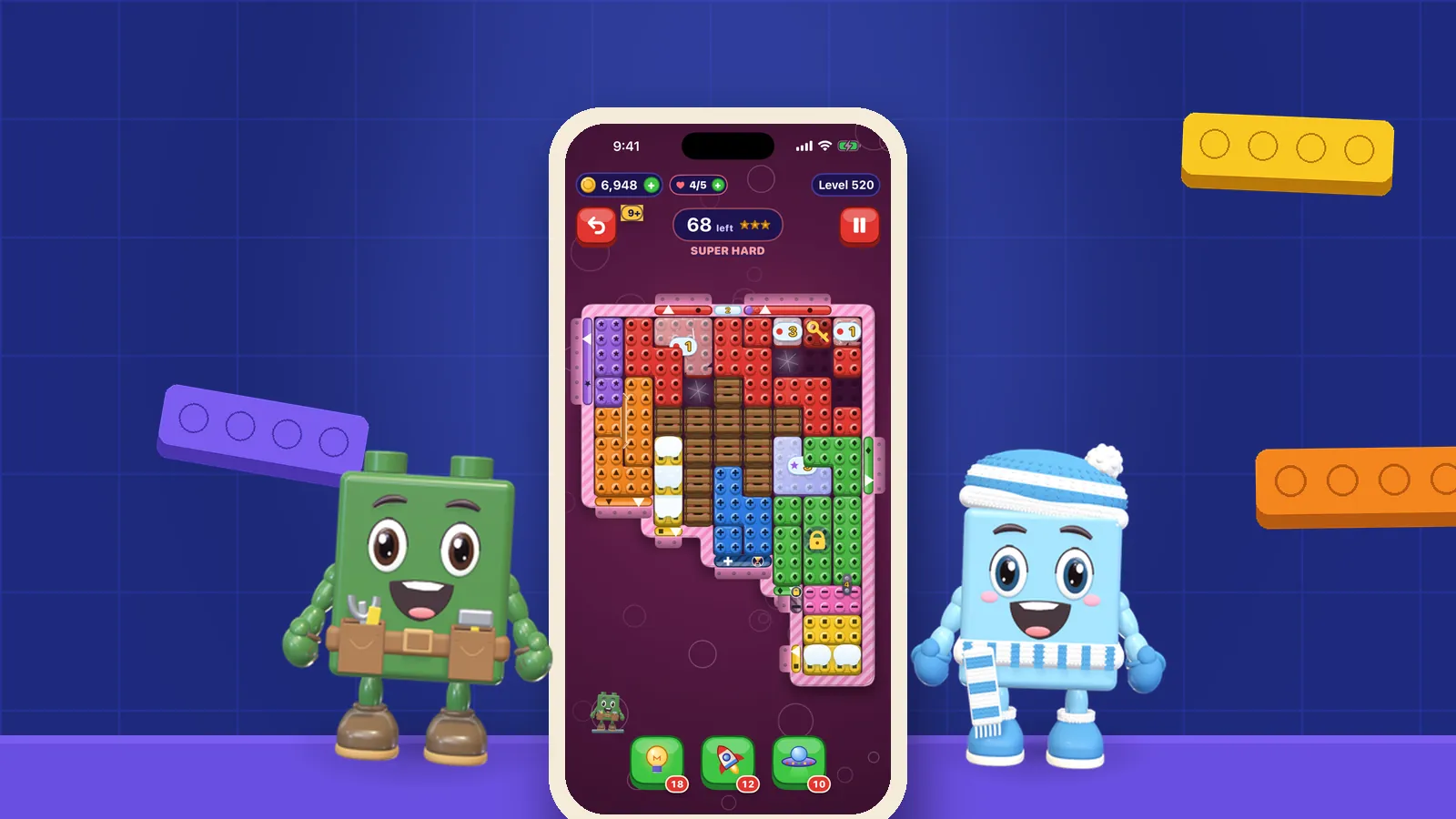
In a colour-sort puzzle, colour is not decoration; it is the rule. In OutBrick every brick goes home only through the gate of its own colour, and three or more of a colour in a line clear, so a player who cannot tell two colours apart cannot play. That is why colour-blind glyphs are on by default: every brick and every gate carries a matching symbol, so shape carries the sort as well as hue. We explain the reasoning in why colour should never be the only clue in a puzzle, and the accessibility page lists the rest of the support, including VoiceOver.
Mood and readability can live side by side if they are given different jobs. OutBrick’s Journey passes through 167 brick-built villages, from Cherry Blossom Town to Lavender Hills, and the scenery can change while the bricks on the board keep their colours and glyphs. For the practical side of reading a colour board quickly, see our colour sort puzzle tips. The research above adds a few principles that apply to any game with coloured pieces:
- Separate pieces by lightness as well as hue, so they stay distinct in dim light, on a cracked screen or for low vision.
- Give each colour one job, and keep it consistent across the whole game.
- Back every colour meaning with a second cue: a glyph, a shape, a position or a label.
- Use saturation and brightness to set mood, and keep the pieces themselves the clearest thing on screen.
- Test in greyscale. If the board still reads, the colours are doing extra work rather than all of it.
Sources5Legge, G. E., Parish, D. H., Luebker, A., & Wurm, L. H. (1990). Psychophysics of reading. XI. Comparing color contrast and luminance contrast. Journal of the Optical Society of America A, 7(10), 2002–2010.3Geslin, E., Jégou, L., & Beaudoin, D. (2016). How color properties can be used to elicit emotions in video games. International Journal of Computer Games Technology, 2016, 5182768.
Filed under
Questions, answered
A few useful answers
How does colour affect emotions in games?
One study found that the brightness, saturation and lightness of game scenes correlated with emotions such as joy, sadness, fear and serenity. The research is still young, so specific claims about individual colours should be treated with caution.
Are colour meanings the same in every culture?
Largely. A study of 4,598 people in 30 nations found very similar colour–emotion associations worldwide, with smaller differences linked to language and geography.
Why is contrast important in game interfaces?
Contrast, especially the difference in lightness between an element and its background, makes things faster to read and find. Readers with low vision rely on lightness contrast more than on differences in hue.
What contrast ratio should game text have?
The Web Content Accessibility Guidelines ask for at least 4.5:1 between normal text and its background, and 3:1 for large text, at their AA level. Games are not bound by them, but they are a sensible, well-tested floor.
Can colour-blind players play OutBrick?
Yes. Colour-blind glyphs are on by default, so every brick and gate carries a matching symbol as well as a colour, and VoiceOver is supported. Our guide to colour blindness in games covers how common it is and what else helps.
APA 7
References
Where a source is a studio’s own history or a news account rather than a study, the article says so beside the claim.
- Elliot, A. J., & Maier, M. A. (2014). Color psychology: Effects of perceiving color on psychological functioning in humans. Annual Review of Psychology, 65, 95–120. doi.org/10.1146/annurev-psych-010213-115035 (opens in a new tab)
- Jonauskaite, D., Abu-Akel, A., Dael, N., Oberfeld, D., Abdel-Khalek, A. M., Al-Rasheed, A. S., Antonietti, J.-P., Bogushevskaya, V., Chamseddine, A., Chkonia, E., Corona, V., Fonseca-Pedrero, E., Griber, Y. A., Grimshaw, G., Hasan, A. A., Havelka, J., Hirnstein, M., Karlsson, B. S. A., Laurent, E., … Mohr, C. (2020). Universal patterns in color-emotion associations are further shaped by linguistic and geographic proximity. Psychological Science, 31(10), 1245–1260. doi.org/10.1177/0956797620948810 (opens in a new tab)
- Geslin, E., Jégou, L., & Beaudoin, D. (2016). How color properties can be used to elicit emotions in video games. International Journal of Computer Games Technology, 2016, 5182768. doi.org/10.1155/2016/5182768 (opens in a new tab)
- Hall, R. H., & Hanna, P. (2004). The impact of web page text-background colour combinations on readability, retention, aesthetics and behavioural intention. Behaviour & Information Technology, 23(3), 183–195. doi.org/10.1080/01449290410001669932 (opens in a new tab)
- Legge, G. E., Parish, D. H., Luebker, A., & Wurm, L. H. (1990). Psychophysics of reading. XI. Comparing color contrast and luminance contrast. Journal of the Optical Society of America A, 7(10), 2002–2010. doi.org/10.1364/josaa.7.002002 (opens in a new tab)