

Why colour should never be the only clue in a puzzle
The case for pairing colour with shape, text, and other signals—so a readable board stays readable for more players.
Colour is expressive. It is also an unreliable single source of truth. The most welcoming puzzles use colour to make a pattern beautiful, then reinforce meaning with shape, text, spacing, or motion.
The W3C’s guidance for Success Criterion 1.4.1 is direct: colour should not be the only visual means of distinguishing information. The reason is practical. People do not all see colours the same way, and information can disappear when it is encoded only in hue.
A product does not have to turn grey to meet it. Colour can keep doing what it does best (hierarchy, mood, emphasis) while another signal carries the rule a player must not miss.
Sources1World Wide Web Consortium. (n.d.). Understanding Success Criterion 1.4.1: Use of color. Web Accessibility Initiative.
Microsoft’s game accessibility overview recommends communicating information in more than one way, such as an image as well as text or a symbol as well as colour. It also asks designers to consider whether a game remains playable with sound muted, on a black-and-white display, and after a long break.
Those are good questions for any puzzle, not only an accessibility checklist. A player who can confirm a match through shape is not doing extra work; they are getting a second route to the same understanding.
Sources2Microsoft. (n.d.). Making games accessible. Microsoft Learn.
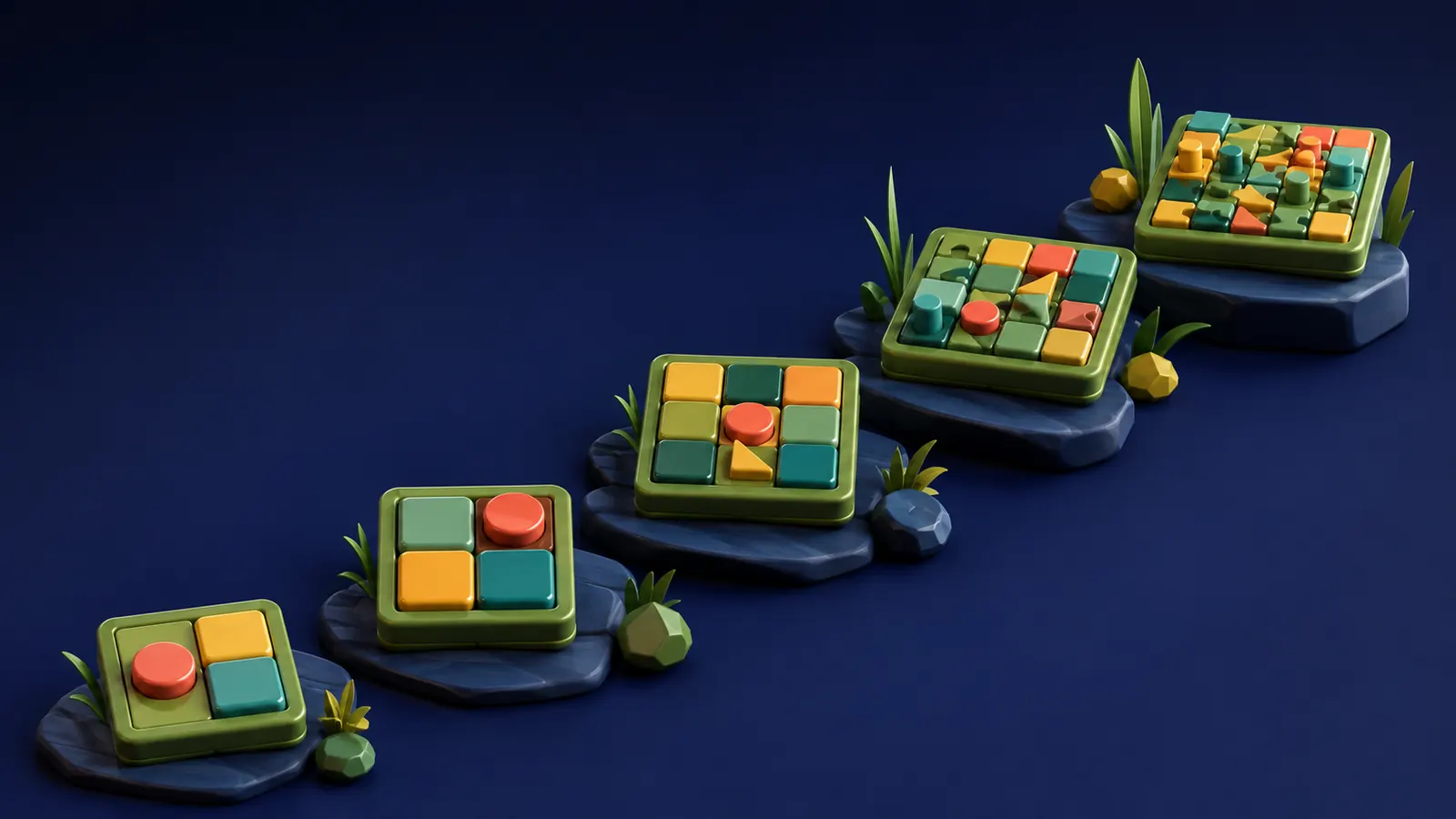
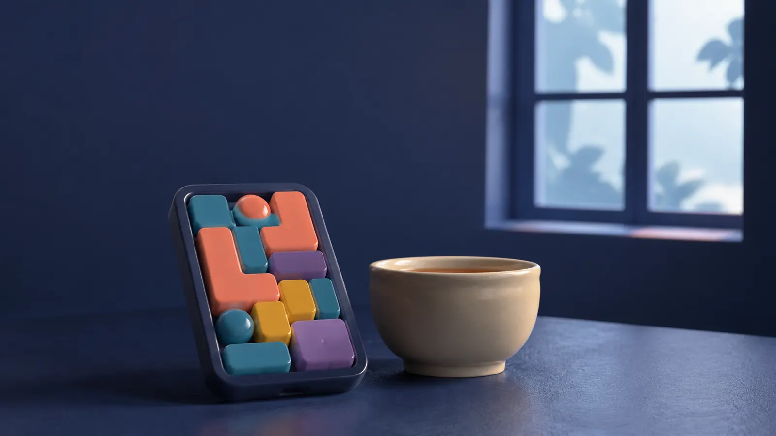
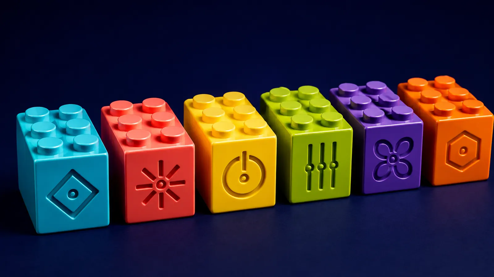
OutBrick carries every brick’s identity through three channels at once: hue, shape and studs. Colour-blind mode is on by default and stamps a distinct glyph on every brick and every gate, so colour is never the only sort key. The visual system stays playful because the signals are part of the toy language: little marks you can read with your eyes and your memory.
The same thinking runs past the board. Every brick is also a VoiceOver element that says its colour, shape and position, Larger Text scales throughout, and Reduce Motion is honoured everywhere. We still need testing with players who have different access needs; documentation is not a substitute for feedback. The accessibility page lists what ships today.
Sources1World Wide Web Consortium. (n.d.). Understanding Success Criterion 1.4.1: Use of color. Web Accessibility Initiative.2Microsoft. (n.d.). Making games accessible. Microsoft Learn.
Inclusive design often improves the base experience because it forces a team to ask whether the game is communicating or merely decorating. That pressure leads to stronger contrast, clearer feedback, better options, and fewer moments where the player has to guess what the screen means.
For a puzzle, clarity is not a concession. It is the material the challenge is made from. If the player cannot reliably read the rule, they are solving the interface instead of solving the board.
Sources2Microsoft. (n.d.). Making games accessible. Microsoft Learn.1World Wide Web Consortium. (n.d.). Understanding Success Criterion 1.4.1: Use of color. Web Accessibility Initiative.
Filed under
APA 7
References
Where a source is a studio’s own history or a news account rather than a study, the article says so beside the claim.
- World Wide Web Consortium. (n.d.). Understanding Success Criterion 1.4.1: Use of color. Web Accessibility Initiative. www.w3.org/WAI/WCAG22/Understanding/use-of-color (opens in a new tab)
- Microsoft. (n.d.). Making games accessible. Microsoft Learn. learn.microsoft.com/en-us/windows/uwp/gaming/accessibility-for-games (opens in a new tab)