Dyslexia-friendly game text: fonts, spacing and plain words
Do dyslexia fonts work? What eye-tracking and reading studies say about typefaces, size, letter spacing and wording, and how to make game text easier to read.
Games are full of words: tutorials, tooltips, menus, speech bubbles, the small print on a reward. For players with dyslexia, badly set text can turn a pleasant game into a reading test. The good news is that the research on what helps is fairly clear, and some of it runs against popular belief. Specially designed dyslexia fonts, for instance, have not held up well in studies. Size, spacing and plain wording have. Here is what the evidence says and how we try to apply it.
Fonts designed for dyslexic readers, with weighted bottoms and exaggerated letter shapes, are widely recommended. The controlled evidence is not kind to them. Wery and Diliberto compared OpenDyslexic with Arial and Times New Roman for primary school pupils with dyslexia across letter naming, word reading and nonsense-word reading, and found no improvement in speed or accuracy for any individual child or the group. None of the children said they preferred it.
Kuster and colleagues tested the Dyslexie font in two experiments with more than 250 children with dyslexia and a comparison group without. Text and word lists in Dyslexie were read no faster and no more accurately than in Arial or Times New Roman, most children preferred the ordinary fonts, and preference was unrelated to how well they read. In an eye-tracking study by Rello and Baeza-Yates, which compared a range of typefaces with readers with dyslexia, OpenDyslexic again did not improve reading. Font choice did matter in that study, though: sans-serif, monospaced and roman styles helped, and italics made reading harder.
None of that means someone who likes a dyslexia font should stop using it. Comfort matters, and if a font makes reading feel easier, that is a good reason to use it. It does mean a game should not treat a special font as the whole answer.
Sources1Wery, J. J., & Diliberto, J. A. (2017). The effect of a specialized dyslexia font, OpenDyslexic, on reading rate and accuracy. Annals of Dyslexia, 67(2), 114–127.2Kuster, S. M., van Weerdenburg, M., Gompel, M., & Bosman, A. M. T. (2018). Dyslexie font does not benefit reading in children with or without dyslexia. Annals of Dyslexia, 68(1), 25–42.3Rello, L., & Baeza-Yates, R. (2013). Good fonts for dyslexia. In Proceedings of the 15th International ACM SIGACCESS Conference on Computers and Accessibility (pp. 1–8). ACM.
The best-supported change is space between letters. Zorzi and colleagues found that extra-large letter spacing improved reading on the spot, with no training, in a large sample of Italian and French children with dyslexia. Their explanation is crowding: many dyslexic readers are unusually affected by letters that sit close together, and spacing them out eases the problem. Stagg and Kiss found the same in teenagers: extra-large spacing improved reading speed more for the dyslexia group than for their peers and reduced skipped words, while coloured overlays made no significant difference.
Size helps too. In another eye-tracking study, Rello and Baeza-Yates found that larger text and wider character spacing let readers both with and without dyslexia read significantly faster. A larger study of web readability by Rello, Pielot and Marcos found that readability and comprehension rose with font size, and recommended text of at least 18 points for text-heavy pages; larger line spacing, by contrast, did not help. The practical lesson is to let text get bigger, and to keep letters from crowding.
Sources4Zorzi, M., Barbiero, C., Facoetti, A., Lonciari, I., Carrozzi, M., Montico, M., Bravar, L., George, F., Pech-Georgel, C., & Ziegler, J. C. (2012). Extra-large letter spacing improves reading in dyslexia. Proceedings of the National Academy of Sciences, 109(28), 11455–11459.5Stagg, S. D., & Kiss, N. (2021). Room to read: The effect of extra-large letter spacing and coloured overlays on reading speed and accuracy in adolescents with dyslexia. Research in Developmental Disabilities, 119, 104065.6Rello, L., & Baeza-Yates, R. (2017). How to present more readable text for people with dyslexia. Universal Access in the Information Society, 16(1), 29–49.7Rello, L., Pielot, M., & Marcos, M.-C. (2016). Make it big! The effect of font size and line spacing on online readability. In Proceedings of the 2016 CHI Conference on Human Factors in Computing Systems (pp. 3637–3648). ACM.
Games have particular habits that make reading harder. Unlike a book, a game often asks you to read while something else is happening, and to act on what you read straight away. Stylised display fonts, text laid over busy backgrounds, dialogue that scrolls on its own, and instructions shown once in a pop-up and never again all put extra weight on reading. None of these are necessary. Most of the fixes are about respect for the reader’s pace.
- Use a clear sans-serif for anything a player must read, and save decorative lettering for titles.
- Never use italics for instructions or long passages.
- Support the system text size so text grows when the player asks, and give letters room.
- Put text on a plain, high-contrast panel, not over the game scene.
- Let the player advance dialogue themselves. Never make text vanish on a timer.
- Pair words with icons, so a player can recognise a button without reading it.
- Make instructions easy to find again after the tutorial.
Contrast matters for every reader, and particularly with age. We cover it in designing games for older eyes and hands.
Sources3Rello, L., & Baeza-Yates, R. (2013). Good fonts for dyslexia. In Proceedings of the 15th International ACM SIGACCESS Conference on Computers and Accessibility (pp. 1–8). ACM.6Rello, L., & Baeza-Yates, R. (2017). How to present more readable text for people with dyslexia. Universal Access in the Information Society, 16(1), 29–49.
Typography only goes so far. The words themselves matter as much. Short sentences, common words, one idea per line and the most important word first help readers with dyslexia, and they help everyone else too, especially younger players and people playing in a second language. The W3C’s guidance on reading level makes the same argument for the web. We make a related point about colour in why colour should never be the only clue in a puzzle: important information should never depend on a single channel, and for many players text is a hard channel.
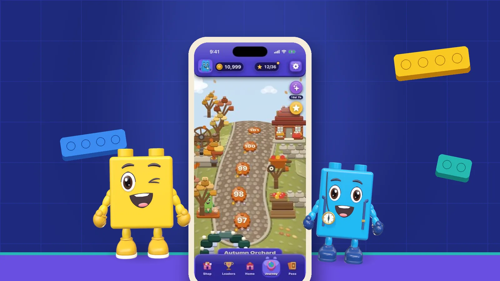
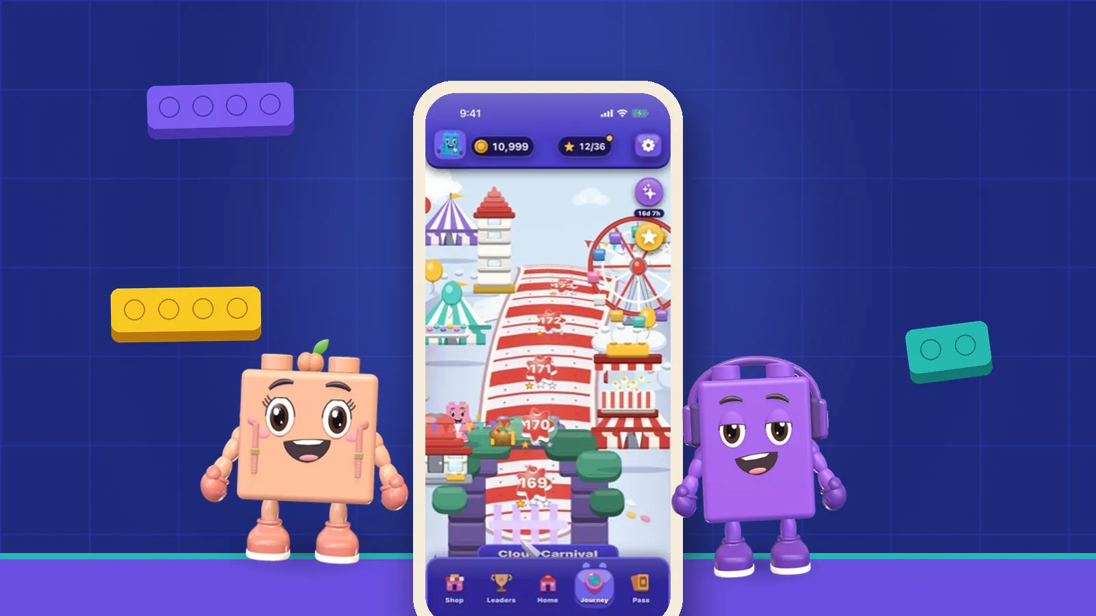
For us this is personal. OutBrick’s nine brick friends speak only in text bubbles, with no voices, so the way those bubbles are written matters. We keep them short, and a board’s goals are shown by its bricks, gates and goal counters rather than by instructions: a brick goes home through the gate of its own colour, and the moves left appear as a number. Larger Text scales throughout. You can see how little reading a board needs by playing one in your browser.
On iPhone and iPad, Settings, Accessibility, Display & Text Size offers Larger Text and Bold Text, and well-made games respect both. Spoken Content, in the same Accessibility menu, can read selected text aloud, and Speak Screen reads everything on screen with a two-finger swipe down from the top. Look for games whose menus use icons as well as words, and do not be shy about using a game’s own text-size or subtitle options. Game settings menus rarely get much love; the ones that work well for dyslexic players are usually good for everyone. For more on how settings and difficulty can open games up, see what Celeste’s Assist Mode teaches.
Above all, dyslexia is not a measure of how well someone plays. Many dyslexic players are excellent at spatial and strategic games, which ask for very different skills from reading. A game that gets its text right simply stops putting an unnecessary obstacle in front of them. If OutBrick’s text gets in your way anywhere, our support page is the place to tell us where.
Filed under
Questions, answered
A few useful answers
What is the best font for dyslexia?
Studies have not found a single best font. Common sans-serif fonts such as Arial and Verdana perform well, italics perform poorly, and specialised dyslexia fonts have not improved reading in controlled studies.
Do dyslexia fonts like OpenDyslexic work?
Controlled studies of OpenDyslexic and Dyslexie found no improvement in reading speed or accuracy for children with dyslexia. Some people still find them comfortable, which is a fine reason to use them.
What makes text easier to read for people with dyslexia?
Larger text and extra space between letters have the strongest evidence. Plain wording, short sentences and text on a clear, high-contrast background also help.
How much reading does OutBrick need?
Very little. Boards are read through bricks, gates, goal counters and a move number, and the brick friends’ text bubbles are kept short. Larger Text scales throughout.
APA 7
References
Where a source is a studio’s own history or a news account rather than a study, the article says so beside the claim.
- Wery, J. J., & Diliberto, J. A. (2017). The effect of a specialized dyslexia font, OpenDyslexic, on reading rate and accuracy. Annals of Dyslexia, 67(2), 114–127. doi.org/10.1007/s11881-016-0127-1 (opens in a new tab)
- Kuster, S. M., van Weerdenburg, M., Gompel, M., & Bosman, A. M. T. (2018). Dyslexie font does not benefit reading in children with or without dyslexia. Annals of Dyslexia, 68(1), 25–42. doi.org/10.1007/s11881-017-0154-6 (opens in a new tab)
- Rello, L., & Baeza-Yates, R. (2013). Good fonts for dyslexia. In Proceedings of the 15th International ACM SIGACCESS Conference on Computers and Accessibility (pp. 1–8). ACM. doi.org/10.1145/2513383.2513447 (opens in a new tab)
- Zorzi, M., Barbiero, C., Facoetti, A., Lonciari, I., Carrozzi, M., Montico, M., Bravar, L., George, F., Pech-Georgel, C., & Ziegler, J. C. (2012). Extra-large letter spacing improves reading in dyslexia. Proceedings of the National Academy of Sciences, 109(28), 11455–11459. doi.org/10.1073/pnas.1205566109 (opens in a new tab)
- Stagg, S. D., & Kiss, N. (2021). Room to read: The effect of extra-large letter spacing and coloured overlays on reading speed and accuracy in adolescents with dyslexia. Research in Developmental Disabilities, 119, 104065. doi.org/10.1016/j.ridd.2021.104065 (opens in a new tab)
- Rello, L., & Baeza-Yates, R. (2017). How to present more readable text for people with dyslexia. Universal Access in the Information Society, 16(1), 29–49. doi.org/10.1007/s10209-015-0438-8 (opens in a new tab)
- Rello, L., Pielot, M., & Marcos, M.-C. (2016). Make it big! The effect of font size and line spacing on online readability. In Proceedings of the 2016 CHI Conference on Human Factors in Computing Systems (pp. 3637–3648). ACM. doi.org/10.1145/2858036.2858204 (opens in a new tab)